
Floating shelves are the ultimate interior design chameleon. They offer a unique blend of minimalist aesthetics and practical storage, serving as a blank canvas for your creative impulses. Unlike bulky bookcases, floating shelves give a room a sense of airiness, making them ideal for small apartments and grand homes alike. However, the line between a curated masterpiece and a cluttered mess is thin. Mastering the art of shelf styling requires an understanding of balance, texture, and visual weight. Whether you are decorating a kitchen, a bedroom, or a home office, these ten styling tricks will transform your floating shelves into a focal point that reflects your personality and elevates your home’s interior design.
1. Layering
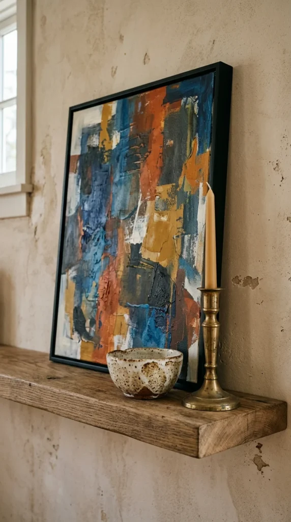
One of the most common mistakes in shelf styling is placing objects in a straight, single line. This creates a flat, two-dimensional look that lacks character. Instead, embrace the concept of layering. Start by placing larger items, such as framed art or mirrors, against the back wall. Then, layer smaller objects—like candles, small sculptures, or bowls—in front of the larger pieces. This overlap creates a sense of depth and complexity. It forces the eye to move through the arrangement rather than just across it. Don’t be afraid to let a smaller item partially block a larger one; this “peek-a-boo” effect adds a professional, designer touch to the display.
2. Palette
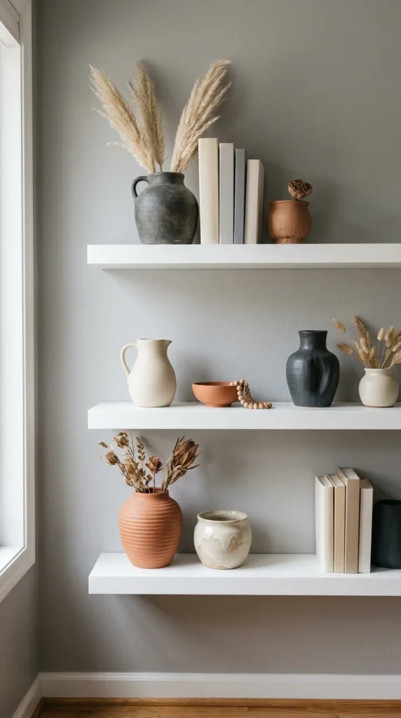
A cohesive color palette is the “glue” that holds your styling together. Without a defined color scheme, your shelves can quickly look like a collection of random odds and ends. To achieve a polished look, choose two or three primary colors and stick to them. You can use varying shades and tones within those colors to keep things interesting. For instance, if you choose a blue and gold theme, you might include navy books, a sky-blue vase, and gold-rimmed picture frames. Incorporating neutral tones like white, cream, or wood grain acts as a visual palate cleanser, preventing the colors from becoming overwhelming. A consistent palette ensures that even if the objects are of different shapes and sizes, they still belong together.
3. Verticality
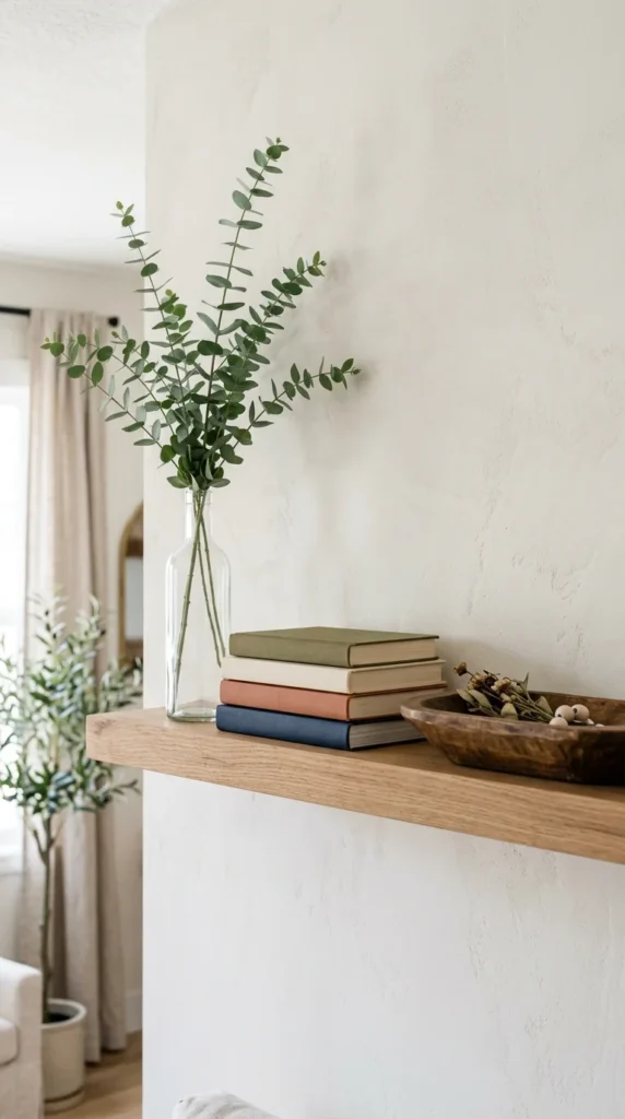
To create a dynamic and engaging display, you must play with different heights. If all your objects are roughly the same height, the shelf will look stagnant. Designers often use the “zig-zag” method, where the eye is led up and down across the shelf. Pair a tall, thin vase with a medium-sized stack of books and a short, squat decorative box. If you have an item you love but it’s too short, use a stack of books as a pedestal to give it the height it needs. By varying the verticality of your items, you create a rhythmic flow that feels intentional and balanced.
4. Greenery
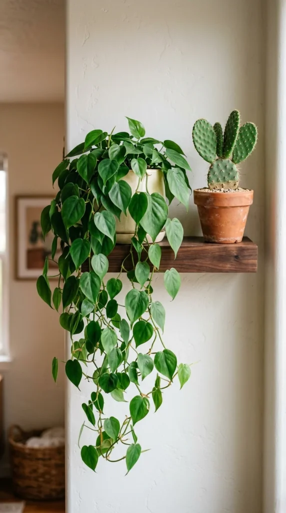
No floating shelf is truly complete without a touch of life. Plants add a vibrant organic element that softens the hard lines of the shelves and the objects they hold. For floating shelves, trailing plants like Pothos, String of Pearls, or Ivy are particularly effective because they break the horizontal plane and draw the eye downward. If your shelves are in a spot with low light, high-quality silk plants or dried botanicals like eucalyptus or pampas grass can provide the same textural benefit without the maintenance. The green hue of living plants acts as a “neutral” in interior design, meaning it complements almost any color scheme you’ve chosen.
5. Books
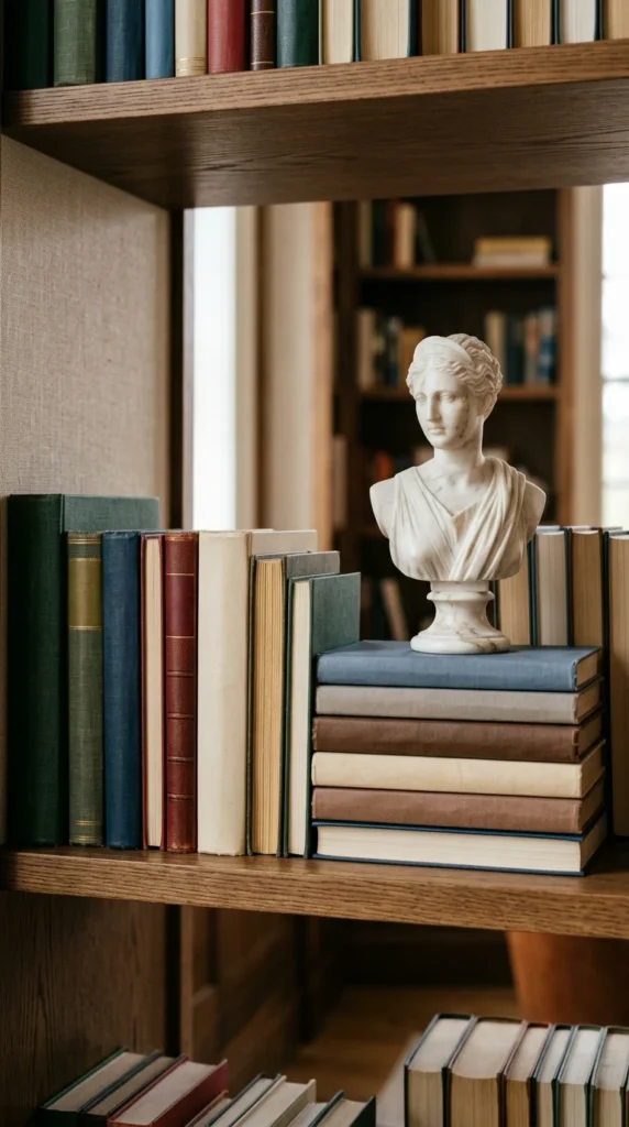
Books are a staple of shelf styling, but they don’t have to be arranged in a traditional library fashion. To make your shelves look more curated, mix up the orientation of your books. Stand some vertically and stack others horizontally. Horizontal stacks are excellent for filling gaps and can serve as platforms for smaller decorative objects. For a cleaner, more minimalist look, some designers prefer to turn the spines toward the wall, exposing the neutral-toned pages. Alternatively, you can group books by color to create a “rainbow” effect or a sophisticated monochromatic block. Books add “soul” to a shelf, suggesting a lived-in, intellectual atmosphere.
6. Grouping
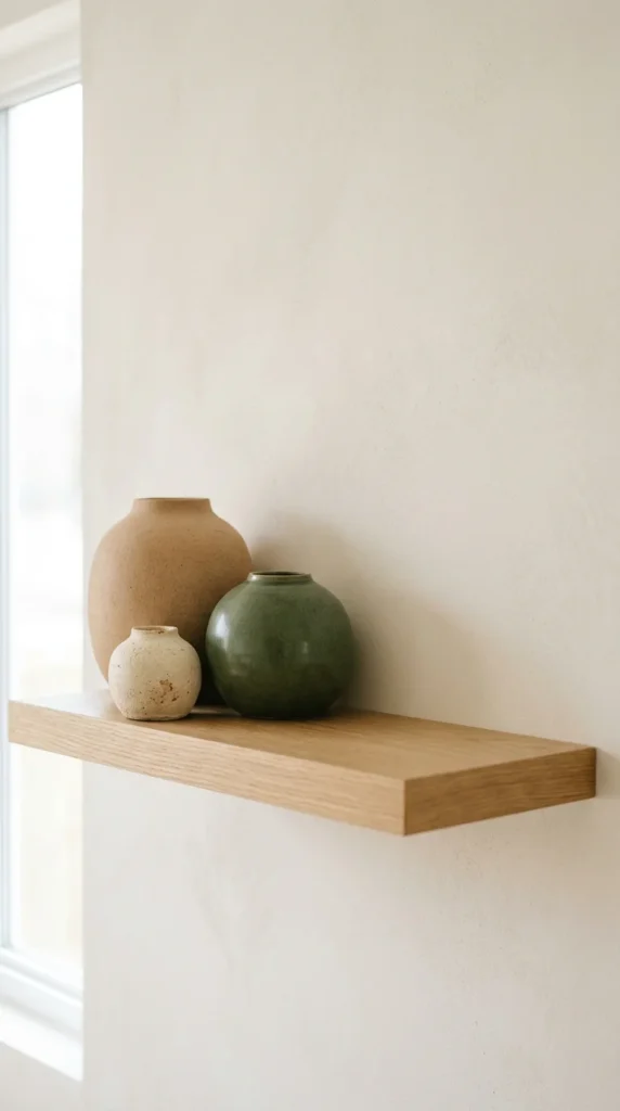
The “Rule of Three” is a classic design principle that suggests objects arranged in odd numbers are more appealing, memorable, and effective than even-numbered groupings. When styling your floating shelves, try grouping items in threes or fives. For example, a group might consist of a tall candle, a medium-sized plant, and a small decorative knot. When grouping, vary the textures and materials—combine a smooth glass surface with a rough ceramic piece and a warm wooden element. This contrast in materiality keeps the eye engaged and makes the arrangement feel like a curated collection rather than a random assortment.
7. Space
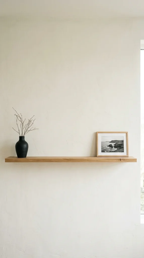
One of the most important elements of design is what you don’t put on the shelf. Negative space, or the empty areas between objects, gives your eyes a place to rest. If every inch of the shelf is covered, the display becomes cluttered and the individual beauty of your items is lost. Allowing for “breathing room” creates a sophisticated, gallery-like feel. It emphasizes the importance of the objects you have chosen to display. If your shelf feels too busy, try removing one or two items. Often, less is more when it involves creating a high-end, professionally styled look.
8. Objects

Floating shelves are the perfect place to showcase items that tell your personal story. While it’s tempting to buy all new “decor” from a big-box store, the most interesting shelves feature personal artifacts. This could be a vintage camera, a seashell from a memorable vacation, a family heirloom, or a piece of handmade pottery. These unique objects add character and serve as conversation starters. The key is to integrate these personal pieces with more modern or standard decor items to ensure the shelf doesn’t look like a cluttered curiosity shop. Mixing old and new creates a timeless aesthetic.
9. Metallics
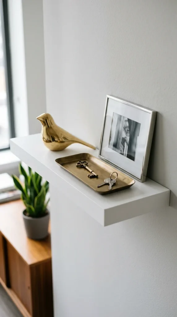
To add a touch of glamour and sophistication to your shelves, incorporate metallic accents. Whether it’s brass, gold, silver, or copper, metallic surfaces catch the light and add a “pop” to your display. A little goes a long way; you don’t need a shelf full of gold. A single brass bowl, a silver picture frame, or a set of copper bookends can elevate the entire arrangement. Metallics work well as a “third color” in your palette, providing a reflective quality that contrasts beautifully with matte textures like wood, stone, or fabric.
10. Lighting
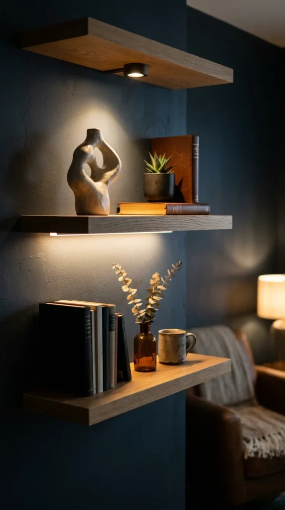
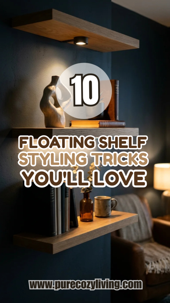
Lighting is the secret ingredient that can take your floating shelves from “good” to “extraordinary.” Well-placed lighting highlights the textures of your objects and creates a moody, inviting atmosphere in the evening. You don’t need expensive hard-wiring to achieve this; battery-operated LED puck lights or thin light strips can be tucked under the shelves to provide “downlighting.” Alternatively, a small, stylish lamp placed on a shelf can add a warm glow and serve as a decorative object in its own right. Lighting adds a layer of professionalism and ensures your hard work is visible even after the sun goes down.