Color blocking is not just a trend; it is a declaration of confidence in interior design. This high-impact technique involves pairing contrasting colors in solid blocks to define spaces, highlight architectural features, and inject personality into a home. For the fearless decorator, color blocking offers a way to move beyond safe neutrals and embrace a vibrant, curated lifestyle. By focusing on the interplay of saturated hues, varied textures, and intentional furniture placement, you can transform any room into a living piece of modern art. In this guide, we explore twenty sophisticated ways to use bold palettes to create an atmosphere that is both visually stunning and deeply personal.
1
The Emerald and Terracotta Dialogue
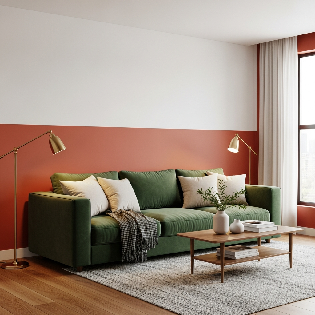
Pairing the deep, jewel-toned richness of emerald green with the earthy warmth of terracotta creates a grounded yet luxurious atmosphere. In a living room, try painting the lower half of the wall in a matte terracotta finish while keeping the top half a crisp white, then anchor the space with a plush emerald velvet sofa. The contrast between the cool green and the organic clay tones provides a sophisticated balance that feels both ancient and contemporary.
2
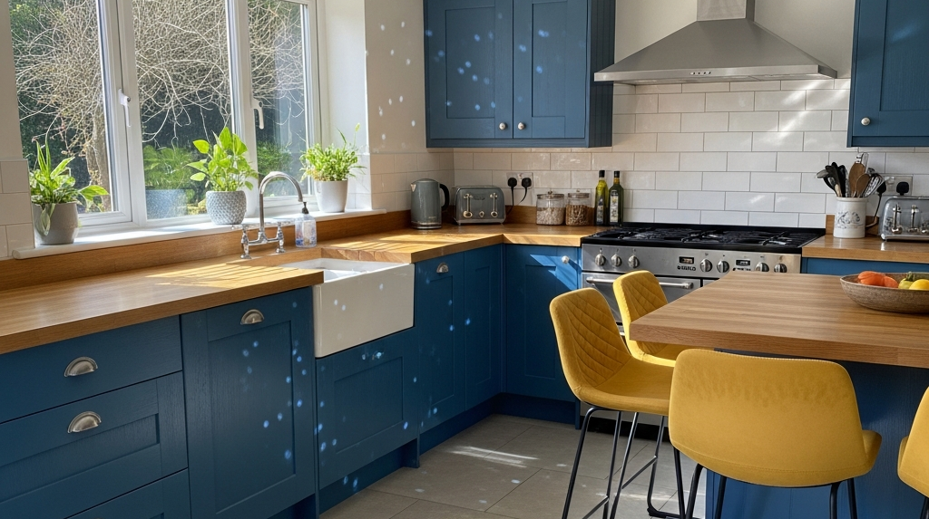
Cobalt Blue and Mustard Yellow Kitchen Accents
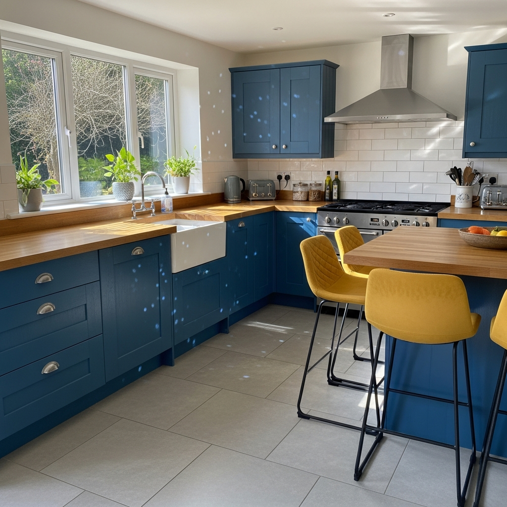
For a kitchen that radiates energy, look to the high-contrast pairing of cobalt blue and mustard yellow. Consider painting kitchen islands or lower cabinetry in a deep cobalt gloss, contrasted against mustard yellow bar stools or a tiled backsplash. This primary-color-inspired duo is softened by using natural wood textures, such as white oak countertops, which prevent the bold colors from feeling overwhelming while maintaining a sharp, modern edge.
3
Blush Pink and Forest Green Sophistication
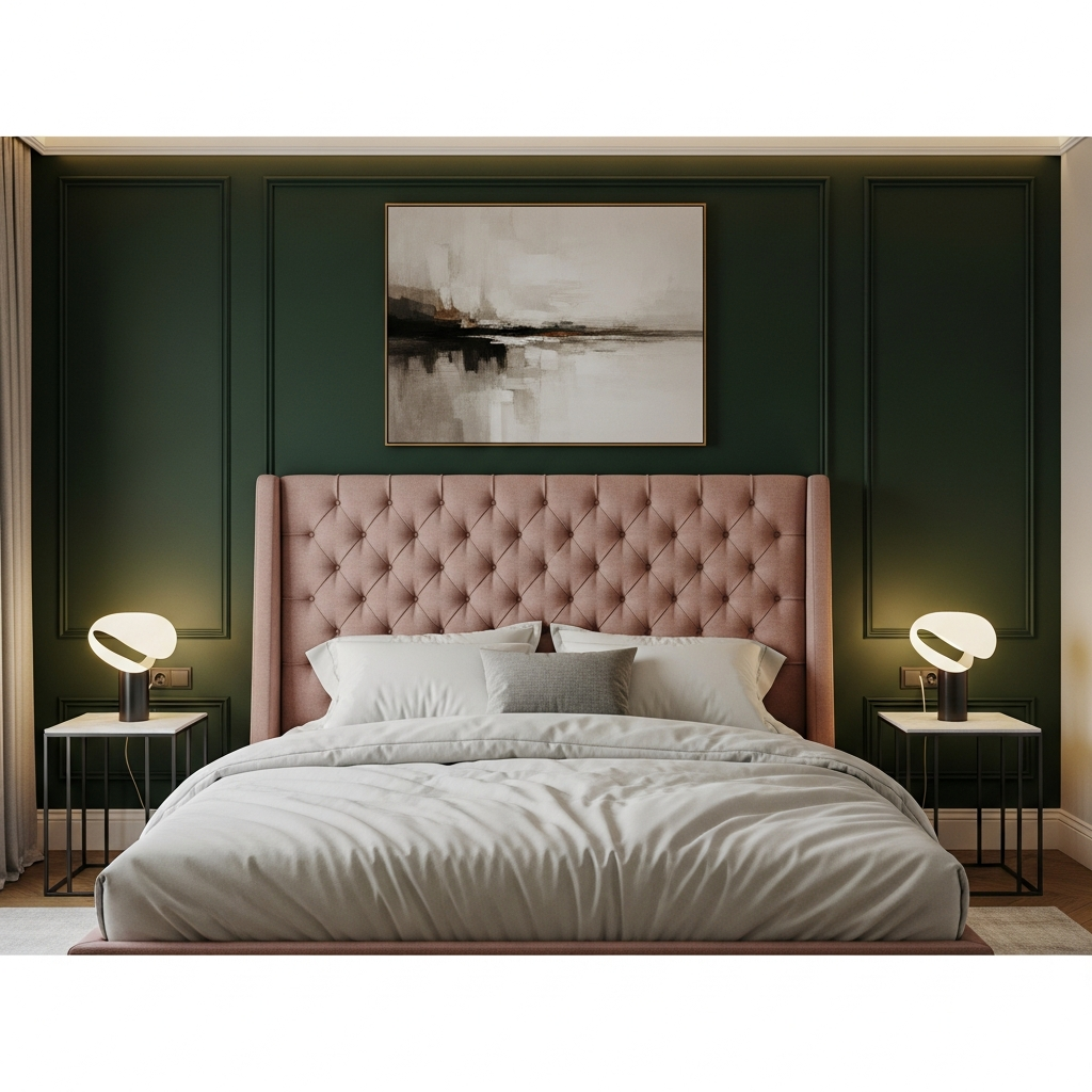
The combination of soft blush pink and moody forest green offers a masterclass in tonal tension. In a bedroom setting, a forest green accent wall serves as a dramatic backdrop for a soft pink upholstered bed frame. Incorporate silk or satin textures to elevate the elegance, and use matte black hardware to ground the sweetness of the pink, resulting in a space that feels both romantic and mature.
4
Electric Purple and Lavender Layers
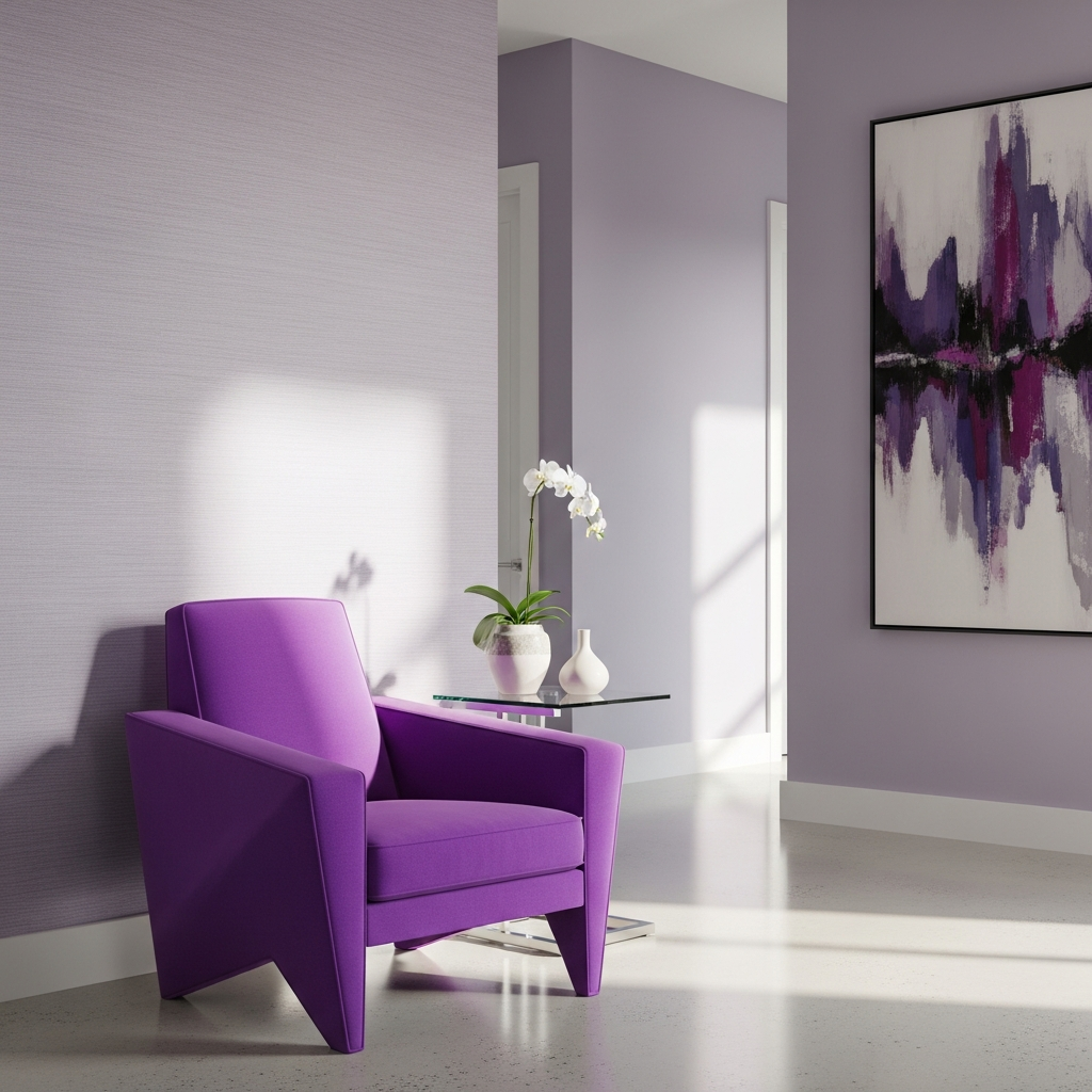
Monochromatic color blocking using different intensities of the same hue can be incredibly striking. Use a vibrant electric purple for a statement armchair or a rug, set against walls painted in a soft, ethereal lavender. This layering technique creates depth and movement within a hallway or reading nook. To keep the look modern, choose furniture with clean, geometric silhouettes and avoid overly ornate patterns.
5
Sunshine Yellow and Slate Grey Balance
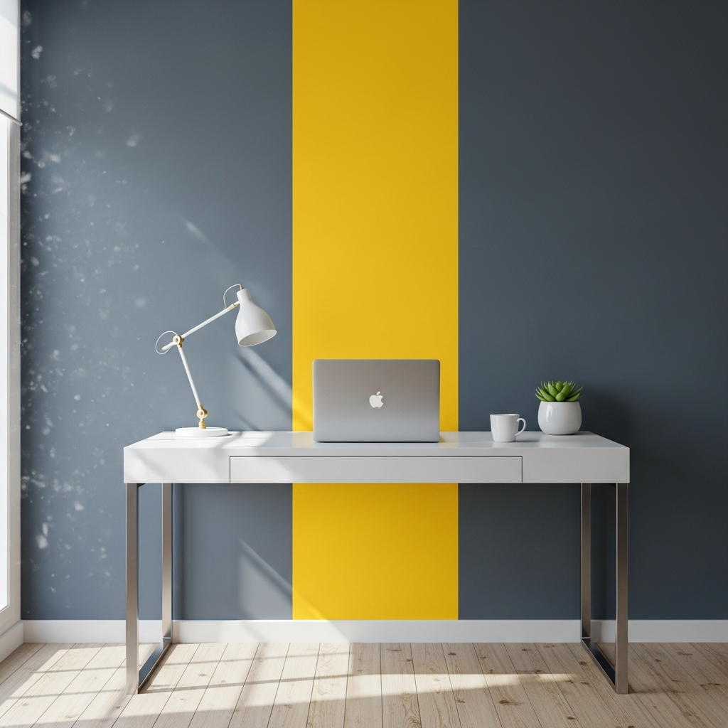
Yellow and grey is a classic pairing that benefits from a bold color blocking approach. In a home office, paint a large vertical stripe of sunshine yellow behind a desk area to define the workspace, surrounded by slate grey walls. The grey provides a professional, calming foundation, while the yellow stimulates creativity and focus. Use sleek, powder-coated metal furniture to lean into an industrial-chic aesthetic.
6
Crimson Red and Powder Blue Contrast
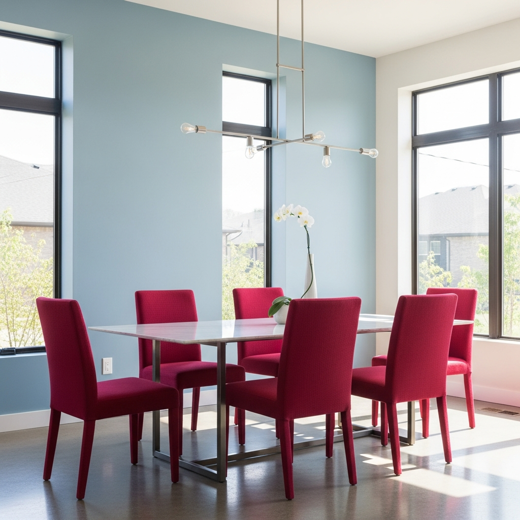
This unexpected pairing is perfect for those who want a dining room that sparks conversation. Use a bold crimson red for the dining chairs and pair them with a large, powder blue sideboard or wall panel. The warmth of the red is cooled significantly by the blue, creating a vibrant visual vibration. Incorporate white marble surfaces to provide a neutral break and reflect light around the room.
7
Tangerine and Teal Energy
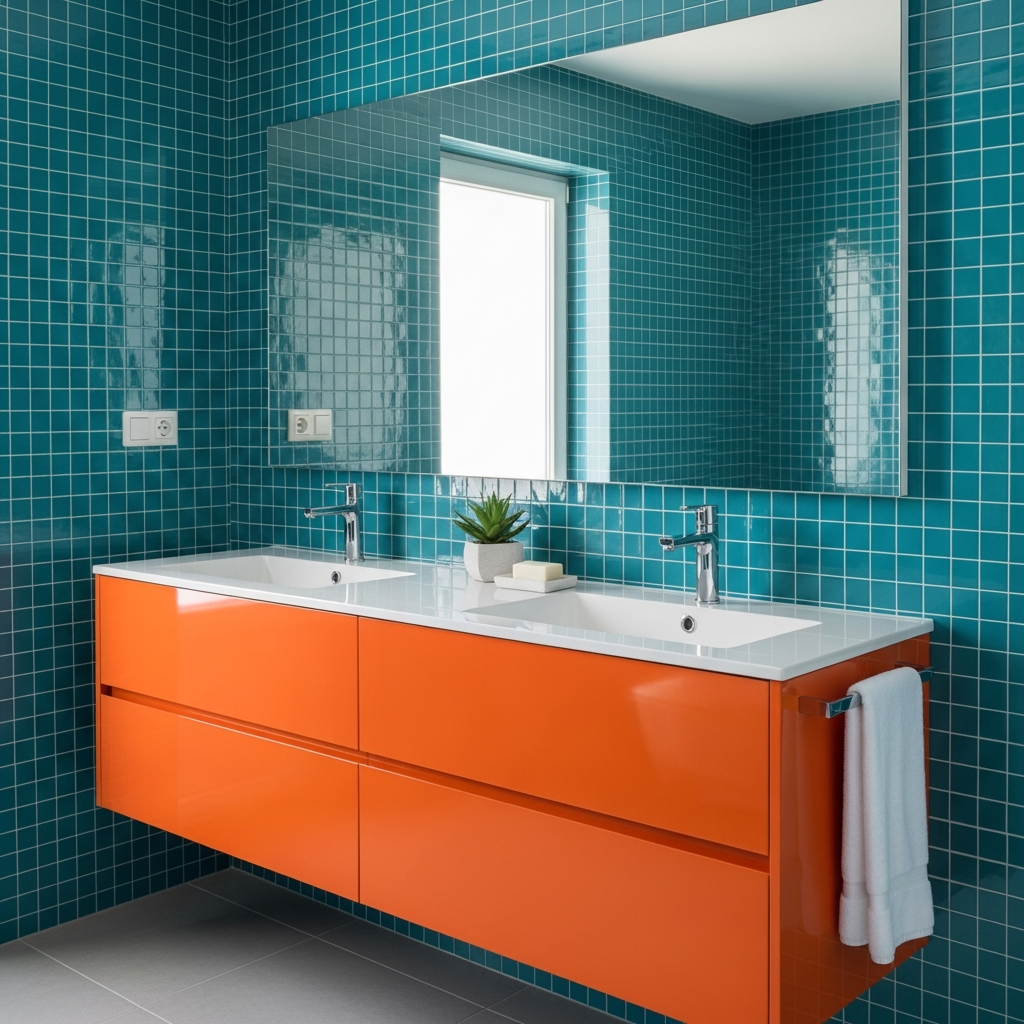
For a bathroom that feels like a tropical escape, use tangerine and teal in large, distinct blocks. Teal subway tiles in the shower area can be offset by a tangerine-painted vanity or bold orange textiles. These complementary colors sit opposite each other on the color wheel, ensuring maximum impact. Use chrome fixtures to add a touch of cool brilliance that complements the water-inspired teal tones.
8
Midnight Black and Crisp White Geometry
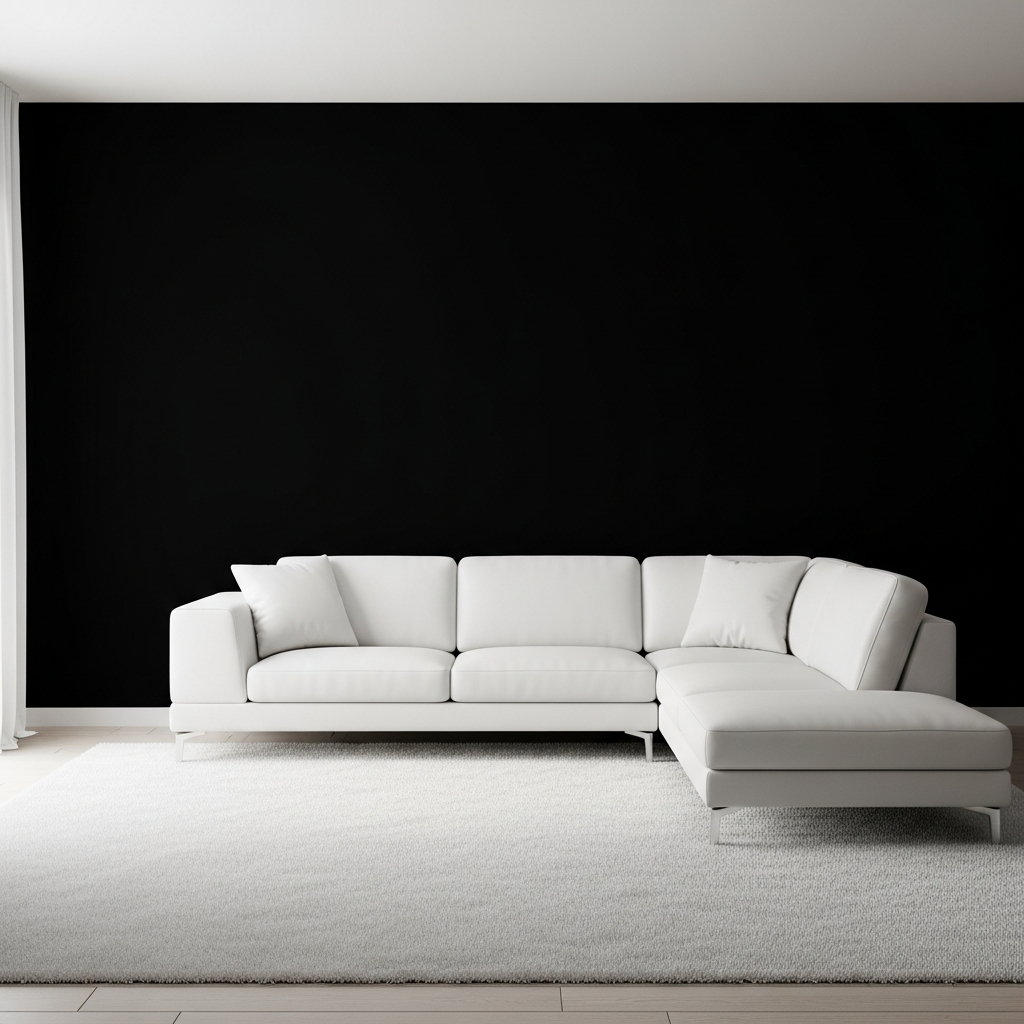
The ultimate color block is the high-contrast duo of black and white. To make this feel fearless, use large architectural blocks rather than small patterns. Imagine a room where one entire wall is painted midnight black, meeting a white ceiling and floor. Add a large white sectional sofa and black sculptural coffee tables. The key here is to use varied textures, like wool, leather, and stone, to keep the monochrome palette from feeling flat.
9
Sage Green and Peachy Coral Harmony
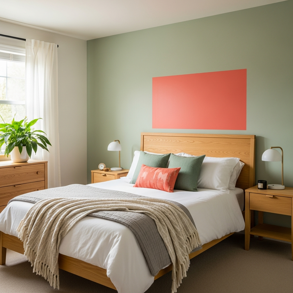
In a guest room, sage green and coral provide a refreshing and welcoming atmosphere. Use sage green for the walls and block out a coral rectangular area behind the bed to act as a faux headboard. This soft approach to color blocking is enhanced by light-colored woods and linen fabrics. It creates a serene environment that still feels curated and high-design.
10
Royal Blue and Gold Leaf Opulence
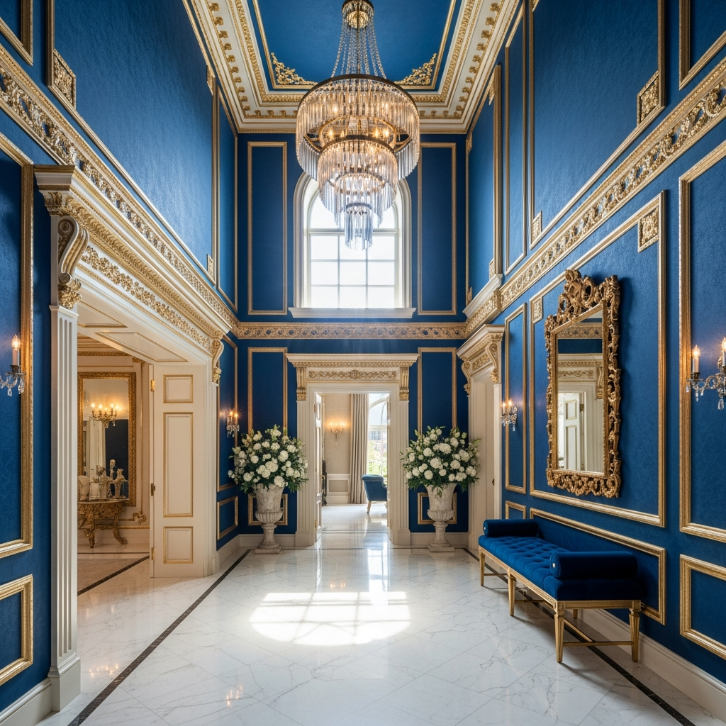
For a grand entryway, royal blue and gold offer an opulent color blocking opportunity. Paint the walls in a deep, matte royal blue and use gold leaf or metallic gold paint to define architectural details like crown molding or a recessed niche. The light-absorbing quality of the blue makes the gold elements shimmer with intensity, creating a dramatic first impression for any visitor.
11
Marigold and Burgundy Depth
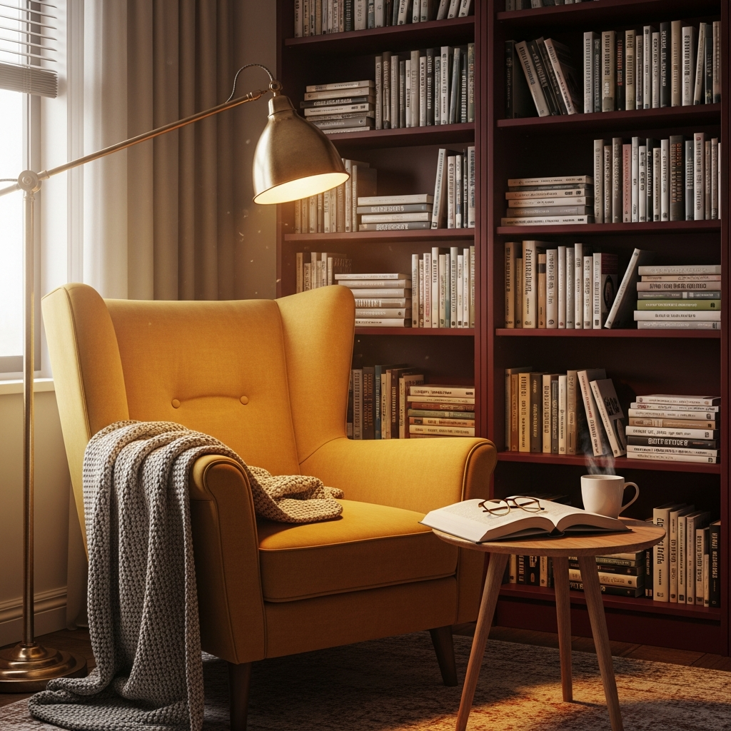
Combining the autumnal warmth of marigold with the sophisticated depth of burgundy creates a cozy, inviting corner. In a library or den, pair a marigold upholstered reading chair with a deep burgundy built-in bookshelf. The richness of these colors is best supported by dark wood flooring and brass accents, which enhance the traditional yet bold feel of the space.
12
Mint Green and Navy Blue Sharpness
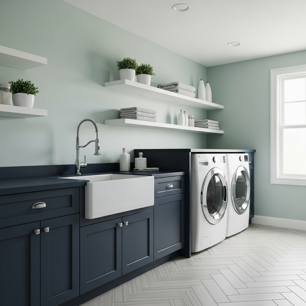
Mint green and navy blue offer a crisp, clean aesthetic that works beautifully in a mudroom or laundry area. Use navy for heavy-duty cabinetry and mint green for the upper walls or shelving. This combination feels organized and fresh. To add interest, use brushed nickel hardware and woven baskets to introduce organic textures that soften the sharp color lines.
13
Fuchsia and Charcoal Grey Modernity
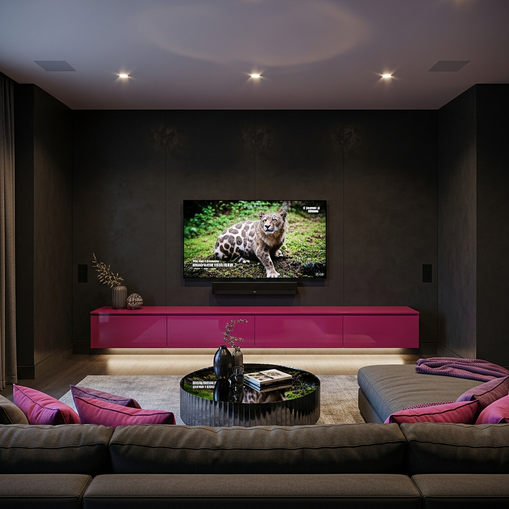
Fuchsia is a daring choice that finds its perfect partner in charcoal grey. In a media room, use charcoal grey for the walls to minimize screen glare, and introduce a fuchsia media console or large-scale ottoman. The grey acts as a heavy anchor, allowing the fuchsia to pop without appearing neon or childish. This pairing is sleek, urban, and undeniably stylish.
14
Olive Green and Burnt Orange Retro Vibes
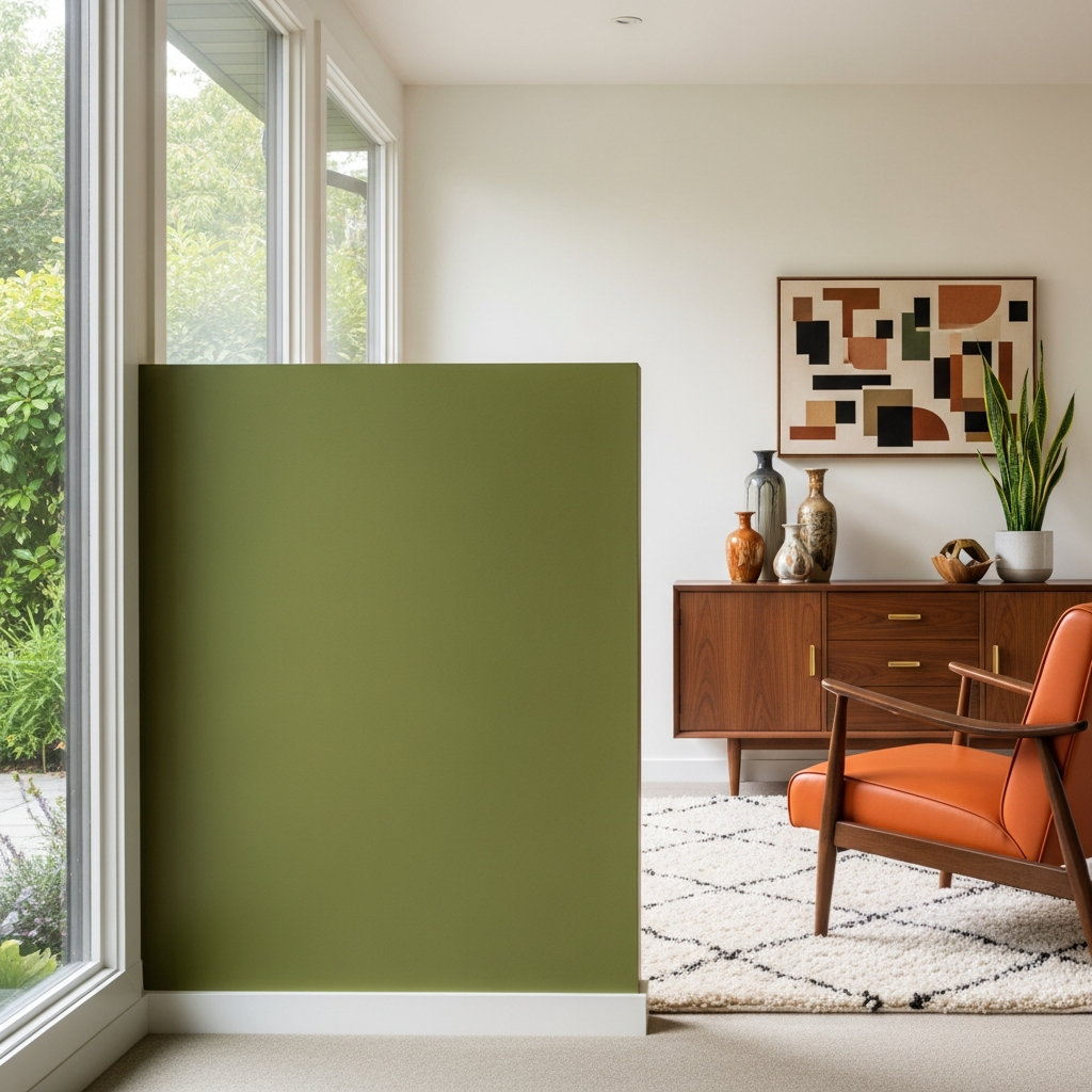
For a look that pays homage to mid-century modern design, use olive green and burnt orange. Block out an area of the wall in olive and place a burnt orange leather lounge chair within that zone. This combination is earthy and nostalgic but feels updated when paired with slim, tapered furniture legs and matte finishes. Add a shaggy cream rug to provide a neutral ground for these two strong colors.
15
Sky Blue and Lemon Yellow Whimsy
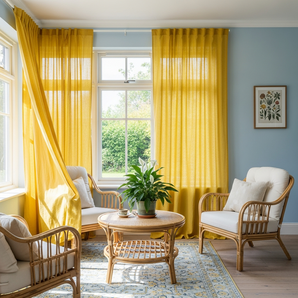
Sky blue and lemon yellow bring a sense of joy and light to a sunroom or nursery. Use large blocks of sky blue on the walls and introduce bright yellow through curtains or a large painted wardrobe. The airy nature of the blue prevents the yellow from feeling too aggressive, resulting in a space that feels like a permanent summer day. Pair with light rattan furniture to complete the breezy look.
16
Plum and Silver Metallic Shine
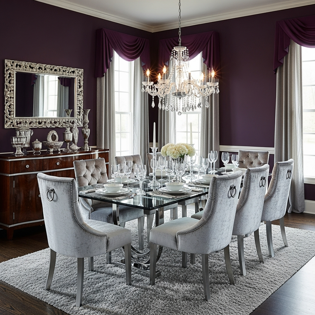
Plum and silver offer a regal and cool-toned color blocking option. In a formal dining room, use plum for the walls and silver-toned velvet for the chair upholstery. The metallic sheen of the silver reflects the deep purple tones, creating a sense of movement. Use a glass dining table to ensure the blocks of color remain the focal point without being interrupted by heavy furniture silhouettes.
17
Ochre and Jade Green Richness
Ochre and jade green provide a sophisticated, global feel to a bedroom or study. Use jade green for a dramatic rug or floor treatment and ochre for the bedding or window treatments. This palette feels inspired by nature and precious stones. Incorporate dark walnut furniture to add a sense of weight and history to the room, enhancing the overall luxurious mood.
18
Coral and Turquoise Patio Play
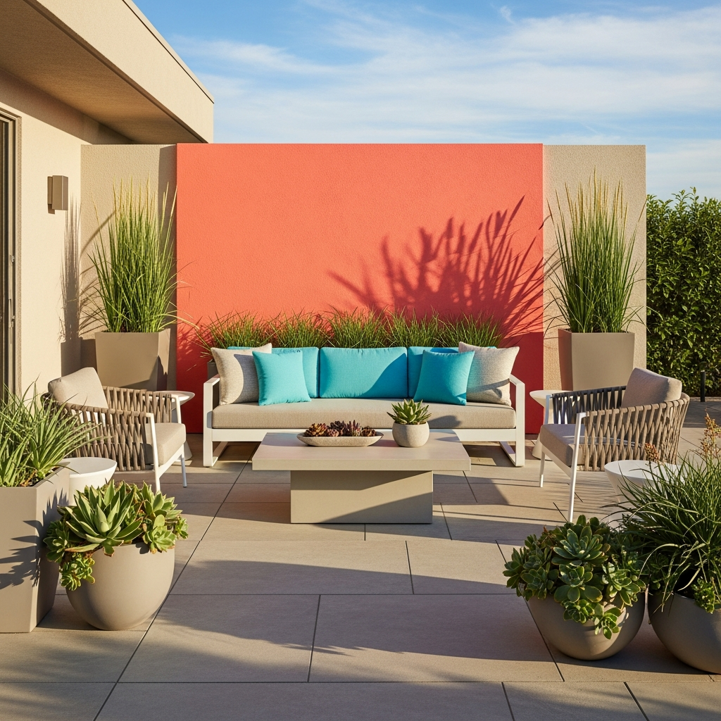
Extend color blocking to your outdoor spaces with coral and turquoise. Use turquoise for your outdoor sofa cushions and pair them with a coral-painted accent wall on the patio. These vibrant colors stand out beautifully against green foliage and blue skies. Use weather-resistant materials like powder-coated aluminum and synthetic wicker to ensure the colors remain bright season after season.
19
Mauve and Espresso Brown Warmth
For a bedroom that feels like a sanctuary, combine the muted elegance of mauve with the deep stability of espresso brown. Use espresso for large-scale furniture pieces like a wardrobe or dresser, and mauve for large blocks of the wall. The coolness of the mauve is warmed by the brown, creating a balanced, cocoon-like effect that is perfect for relaxation.
20
Neon Accents on Neutral Foundations
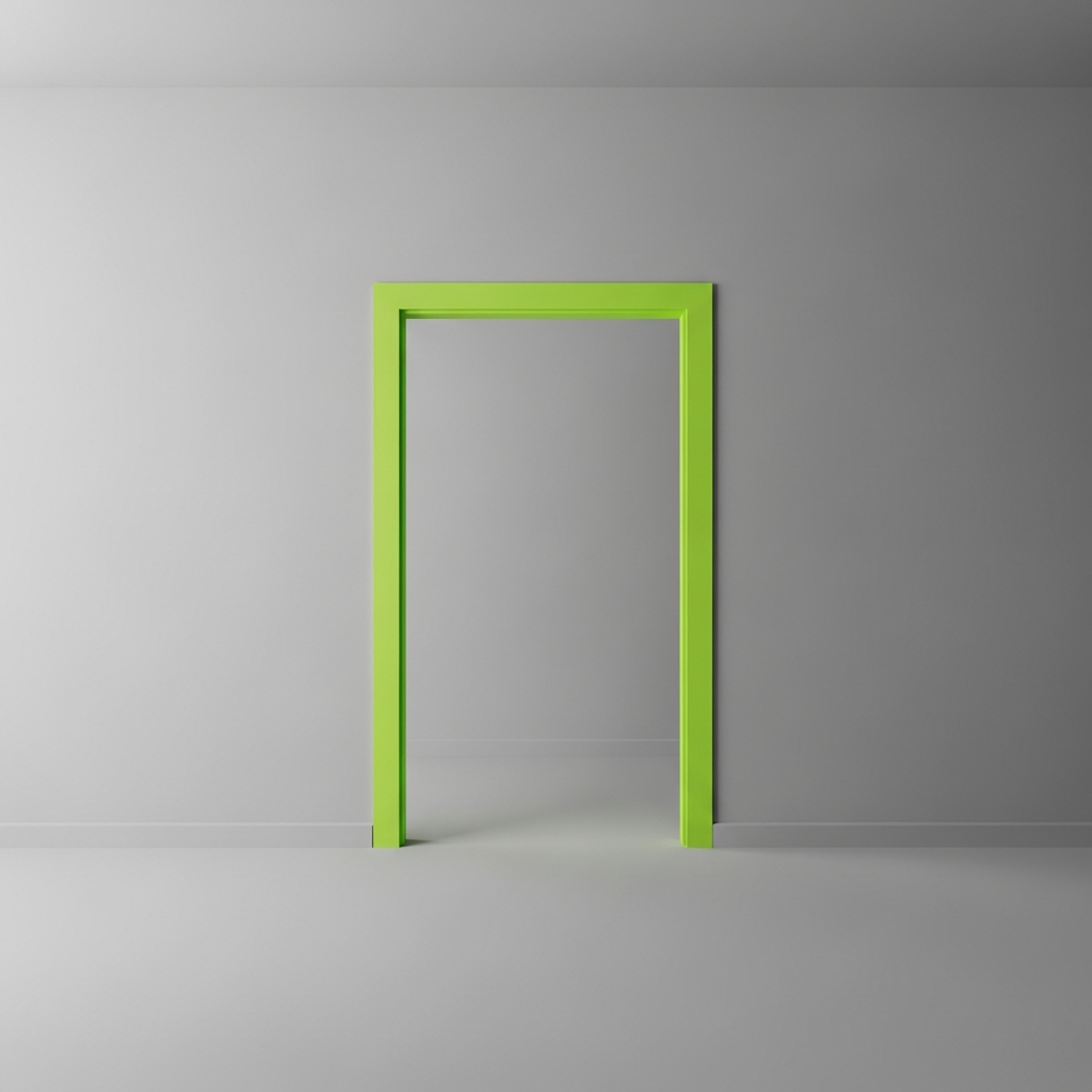
For the ultimate fearless move, use neon color blocking against a neutral foundation. In a modern apartment, use cool grey as your base and introduce a sharp block of neon lime or electric pink in an unexpected place, such as the inside of a bookshelf or a single door frame. This surgical use of color creates a high-concept look that is energetic and undeniably avant-garde.
Conclusion
Color blocking is a powerful tool for self-expression, allowing you to transform your home into a dynamic and inspiring environment. Whether you choose the earthy stability of terracotta and emerald or the electric energy of fuchsia and charcoal, the key is to be intentional with your boundaries and confident in your choices. By focusing on blocks of color, you can highlight the beauty of your furniture’s silhouettes and the unique architecture of your space. We hope these twenty ideas inspire you to pick up a brush, choose a bold palette, and create a home that truly reflects your fearless spirit.